Designing for action, not for dashboards
How prioritization and context shape daily decision-making
The decision at risk
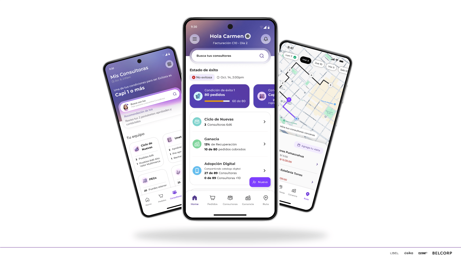
The organization needed to define how a daily use sales force application should prioritize information and guide action for non-specialist users.
The product was being designed as a data-heavy dashboard, closer to a statistical tool, despite being used daily by users who needed clarity, guidance, and timing not exhaustive information.
Why it was risky
Why this mattered
Without prioritization and contextual guidance, the app risked becoming overwhelming, underused, or disconnected from how users actually worked in the field.
My point of view
The problem wasn’t the interface, it was the absence of prioritization.
A daily use product should guide users toward action, not ask them to interpret complex data on their own.
What I needed to understand
Field visits to observe real usage and workarounds
Flow-by-flow analysis to understand decision paths
Benchmark of management-oriented apps facing similar prioritization challenges
Collaborative work with the team to align flows, constraints, and findings
How users made decisions throughout their daily routines, not just at peak moments
Which information actually triggered action versus what only added cognitive load
How context (time, role, situation) changed what “relevant” meant
Where business expectations conflicted with real usage behavior
How this was explored
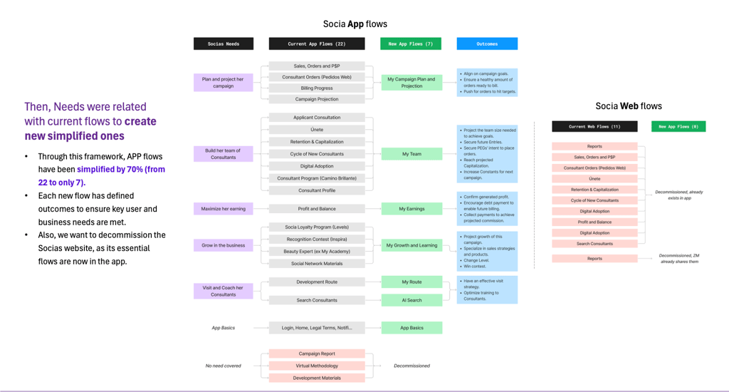
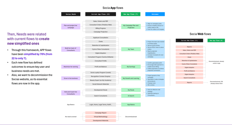
What changed
Excess information was recognized as a barrier to action
The product began guiding users toward what mattered in each moment
Prioritization was grounded in real user context and behavior
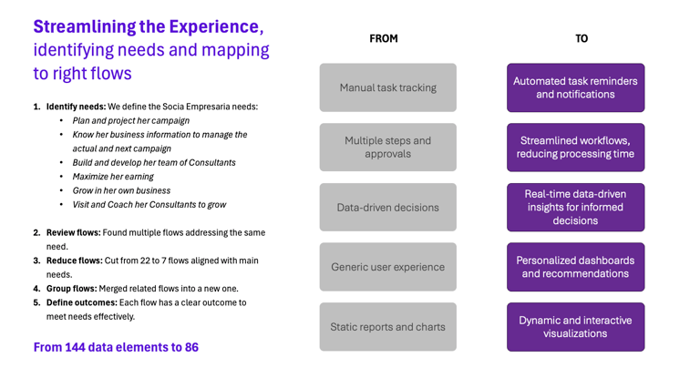
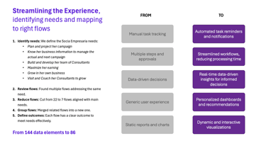
More information was assumed to mean better control
The app expected users to interpret data
Prioritization was driven by internal requests
Before
After
Decisions unlocked
Which information needed to be visible by default and which should remain secondary
How to design flows that supported action, not just monitoring
Where compromises were necessary between business needs and user clarity
How to align the broader team around a shared definition of “useful”
System impact
The product shifted from a passive dashboard to an active decision-support tool
Teams became more aware of the cost of overloading users with information
User context became a reference when discussing new features or requests
This project reinforced that scalability is not about removing complexity, but about deciding where it should live.
Important trade-off
Not every stakeholder need could be fully addressed.
The outcome was a balanced solution that privileged daily usability over exhaustive data visibility